
Access Denied
IMPORTANT! If you’re a store owner, please make sure you have Customer accounts enabled in your Store Admin, as you have customer based locks set up with EasyLockdown app. Enable Customer Accounts

Master the business card dimensions for Australian printing
Posted By Matthew Malios
on
Let's get straight to it. The standard business card size in Australia is a crisp 90mm x 55mm. This isn't just a random number; it's the industry benchmark that ensures your card slips perfectly into wallets and cardholders right across the country. Think of it as the universal key to making a brilliant first physical impression.
Your Blueprint for Standard Business Card Dimensions
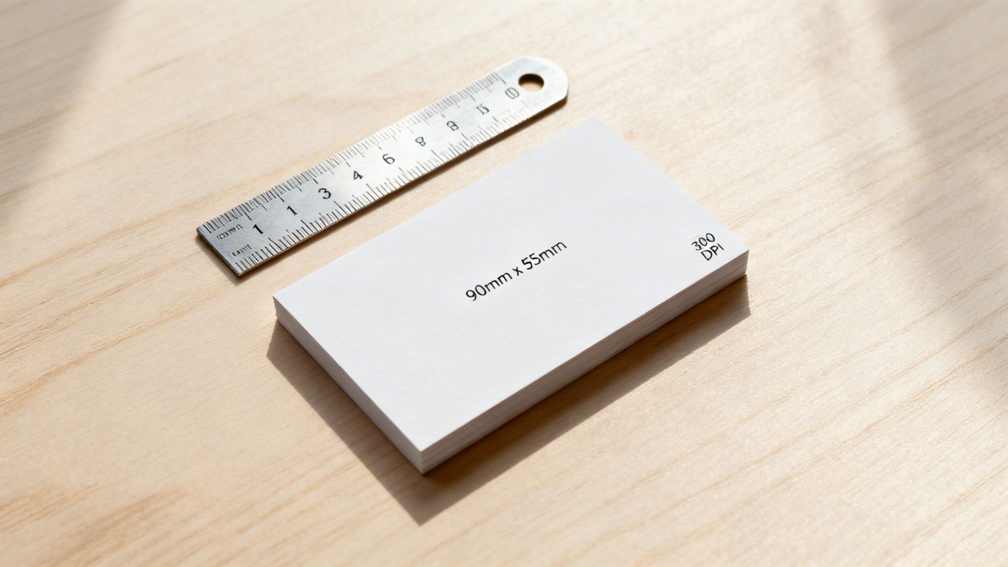
Every great design project starts with getting the measurements right, and business cards are no exception. Embracing the 90mm x 55mm format from the get-go is the secret to a professional result—a card that feels instantly familiar and just right in the hand of a potential client or partner.
This specific size wasn't picked out of a hat. The 90mm x 55mm standard has been the go-to since the early 1990s, taking its cue from European standards to ensure wide compatibility. It's a dimension proven to fit wallets used by over 85% of Australian professionals. After a big push from printing associations, it was found that 92% of cards printed in major cities already matched this size by 1995, cementing its place as the national standard.
Australian Standard Business Card Dimensions Cheat Sheet
To help you hit the ground running, here's a handy cheat sheet. It breaks down the standard 90mm x 55mm into the different units you'll need for your design software and final print setup. Consider this your foundational blueprint for a flawless design.
| Unit | Dimension (Standard) | Dimension (With Bleed) |
|---|---|---|
| Millimetres (mm) | 90mm x 55mm | 96mm x 61mm |
| Inches (in) | 3.54" x 2.16" | 3.78" x 2.40" |
| Pixels (at 300 DPI) | 1063px x 650px | 1134px x 720px |
Remember: Always start your design with these exact business card dimensions. It removes all the guesswork and builds a professional foundation, guaranteeing your final product looks polished and fits perfectly where it needs to.
Getting this standard size right is your first step, but it’s a crucial one that opens the door to powerful branding. That simple rectangle is more than just a piece of cardstock; it’s a tangible piece of your brand’s identity. For those ready to take their branding to the next level, exploring other high-impact business products and merchandise can create a truly cohesive and memorable brand experience.
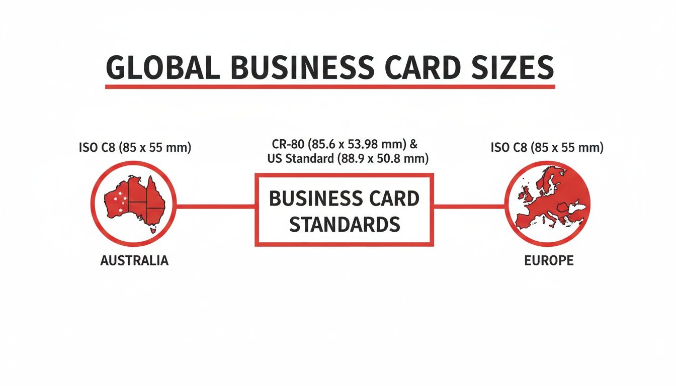
What Are the Standard Business Card Sizes in Australia, the US, and Europe?
Ever noticed how a business card from an overseas colleague feels just a little… different? You're not imagining it. While we favour the classic 90mm x 55mm size here in Australia, dimensions actually change from one country to the next.
It might seem like a tiny detail, but getting it right shows you've thought about who you're meeting. A card that fits perfectly into a local wallet or cardholder is a subtle nod to cultural awareness and makes a far better impression than one that's just slightly off.
A Quick Trip Around the World's Wallets
The variations are small but meaningful. The standard North American card, for instance, is a touch shorter and wider than ours, while the popular European size is a bit slimmer.
Think of your business card as a physical handshake. When it matches local expectations, it’s a small but powerful way to say, “I’ve done my homework, and I’m serious about doing business here.” It signals respect and attention to detail.
These differences can affect more than just the feel; they influence how your card is stored. An oversized card might get awkwardly folded or, worse, left behind. A card that's too small can feel flimsy and get lost in the shuffle.
Standard Business Card Dimensions Around the World
To make sure your card always makes the right first impression, no matter where you are, here’s a simple breakdown of the most common sizes you'll encounter. Keeping these dimensions in mind will help you adapt your design for any market.
| Region | Dimensions (mm) | Dimensions (inches) |
|---|---|---|
| Australia / New Zealand | 90mm x 55mm | 3.54" x 2.17" |
| North America (US / Canada) | 88.9mm x 50.8mm | 3.5" x 2" |
| Europe (Most of) | 85mm x 55mm | 3.35" x 2.17" |
| Japan (Yongo) | 91mm x 55mm | 3.58" x 2.17" |
Adopting a global mindset with your design prepares you for any opportunity that comes knocking. It’s a proactive step that shows true professionalism and sets you apart from anyone taking a one-size-fits-all approach. That kind of care speaks volumes about the quality you bring to everything you do.
Getting to Grips with a Print-Ready Card Design
To create a business card that looks just as sharp in someone's hand as it does on your screen, you first need to understand its basic anatomy. It's a bit like framing a piece of art. Once you master three simple concepts—the safe area, the trim line, and the bleed—you’ll have the key to a flawless, professional print every single time.
This isn't just about following rules for the sake of it. It’s about taking control of the printing process and making sure your creative vision translates perfectly from the digital canvas to the final physical card.
The Safe Area: Your Content’s Fortress
First up is the safe area. Think of this as the inner sanctuary of your card, the space where all your most important information must live. Your name, phone number, logo, and any other critical text or graphics belong here. It’s essentially a protective border set just inside the card's final edge.
By keeping all the crucial stuff within this zone, you guarantee nothing gets accidentally chopped off when the cards are cut. It's the simplest and most effective way to protect your design's integrity.
The Trim Line: The Final Cut
Next, we have the trim line. This is the exact line where the guillotine will cut your business card to its final dimensions—for example, the standard Australian 90mm x 55mm. It represents the finished, physical edge of your card.
Anything placed directly on this line is in the danger zone. While you want your background design to extend way past it, any text or logos sitting right on the trim line could get partially sliced away, which never looks professional.
The Bleed: Your Edge-to-Edge Insurance Policy
Finally, let's talk about the bleed. This is your design's insurance policy against dreaded, ugly white borders. The bleed is an extra margin of your background colour or image that extends beyond the trim line, typically by 3mm on each side.
So, why is this so critical? High-speed cutting machines are incredibly precise, but paper can shift ever so slightly during the process. Without a bleed, even a minuscule shift could leave a jarring sliver of unprinted white paper along one edge of your finished card.
The bleed ensures that even if the cut is a fraction of a millimetre off, your background colour will still run to the absolute edge of the card. This is the secret to achieving that seamless, premium finish.
This infographic shows how standard business card dimensions can vary slightly across different global markets.
As you can see, the differences are subtle but can be crucial for making sure your card fits neatly into local wallets and cardholders. Understanding these components is the foundation of great print design, but the journey doesn't stop here. For a deeper look at how these elements come together in the real world, you can explore our custom printing options and see these principles in action.
By mastering the safe area, trim, and bleed, you're no longer just designing—you're engineering a perfect print.
Getting Your File Print-Ready
Alright, you've got the concepts down. Now, let's roll up our sleeves and turn that brilliant design into a file that any printer will love. This is your pre-flight checklist, the essential steps that bridge the gap between your screen and the final, tangible card in your hand.
Think of it this way: your digital file is the blueprint. A builder can't construct a house from a rough sketch, and a printer can't create a perfect business card from a file that isn't set up correctly. Nailing these steps saves you from the headache (and cost) of a reprint.
Speaking the Printer’s Language: Colour
First things first, let's talk colour. This is where most people trip up. Your computer screen and a printing press speak two completely different languages. Your screen uses RGB (Red, Green, Blue) light to create those vibrant, glowing colours. But a printer uses CMYK (Cyan, Magenta, Yellow, Key/Black) ink.
If you design in RGB, you're setting yourself up for disappointment. Those bright, luminous colours on your monitor simply can't be replicated with ink. When the printer converts the file, your colours will often come out looking flat, muddy, or just plain wrong.
To get what you see, you need to design in the printer's native tongue. Always set up your design file in CMYK from the very beginning. This gives you a much more realistic preview of the final printed colours, so there are no nasty surprises later.
Why Resolution is Everything
Next up: clarity. The sharpness of your printed card all comes down to its resolution, which we measure in DPI (dots per inch). For a website or a social media graphic, 72 DPI is perfectly fine. For print? It’s a recipe for disaster. It will look blurry, pixelated, and unprofessional.
For professional printing, the gold standard is non-negotiable: 300 DPI.
- 300 DPI: This is the magic number. It packs enough tiny dots of ink into every inch to make your text, logo, and images look crisp, clean, and razor-sharp.
- 72 DPI: Designed for screens, this low resolution just doesn’t have the data needed for a quality physical print. The results will scream amateur.
Make sure you set your document to 300 DPI before you even start designing. You can't just take a low-resolution image and "increase" the DPI later—the quality is already lost. You have to start with a high-resolution canvas.
Locking in Your Fonts for Good
Have you ever opened a document on someone else's computer and all the fonts are messed up? That’s because your carefully chosen fonts weren’t installed on their machine. The exact same thing can happen when you send your file to the printer.
The solution is simple: outline your fonts. In design software, this is often called 'Create Outlines'. This powerful little step converts your text from editable characters into fixed vector shapes. It will look exactly the same, but it's no longer a 'font' that can go missing.
This one action locks your typography in place, guaranteeing it will print precisely how you intended it to. For a deeper dive into getting your files just right, check out these super helpful artwork submission tips for beginners. It's a fantastic resource for making sure your hard work translates into a perfect print every time.
Designing Beyond the Standard Rectangle
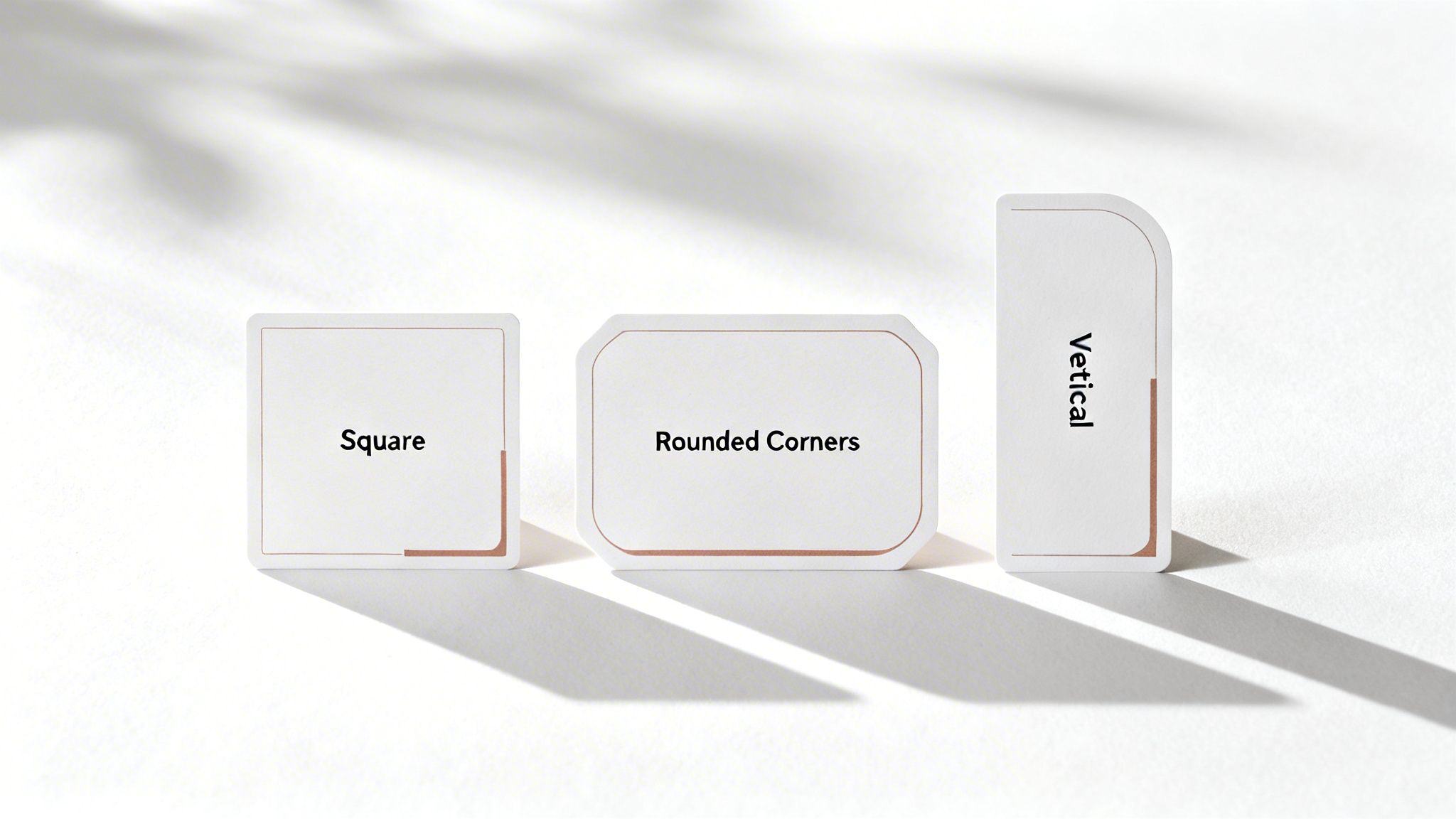
Getting the standard business card dimensions right is your starting point, but the real magic begins when you dare to think outside that 90mm x 55mm box. A unique shape isn’t just a gimmick; it’s a powerful statement that makes your brand unforgettable in a sea of sameness.
This is your opportunity to inject some real personality into your print materials. By playing with the business card dimensions, you create a tangible piece of your brand’s story—something people don't just see, but feel compelled to hold onto and even show others.
Telling a Story with Shape
Different shapes trigger different emotions and can subtly reinforce your brand’s message before anyone reads a single word. Even a small change can completely reshape that all-important first impression.
-
Square Cards: With their clean, symmetrical lines, square cards have a modern, bold, and balanced feel. They’re a fantastic choice for creative agencies, tech startups, or any brand wanting to project a vibe of innovation and style.
-
Rounded Corners: Simply softening the sharp edges of a standard card creates an instant feeling of friendliness, warmth, and approachability. This subtle tweak is perfect for brands in wellness, childcare, or any service-based industry that prides itself on a gentle, welcoming connection.
-
Vertical Orientation: Flipping the layout from landscape to portrait can have a surprisingly dramatic impact. A vertical card feels fresh and dynamic, guiding the eye in a new way. It’s a natural fit for photographers, designers, and any brand that wants to be seen as forward-thinking.
Your business card isn’t just for sharing contact details; it’s a physical extension of your brand identity. The shape you choose is a silent ambassador, communicating your values long after the conversation has ended.
Expanding Your Networking Horizons
While mastering the physical card is crucial, it's also worth exploring what’s next. For those looking to push boundaries, understanding what is a digital business card can open up entirely new avenues for networking. It's another brilliant way to stand out.
Choosing a non-standard shape requires a bit more thought to ensure your design remains both functional and professional. It’s a balancing act, but when you get it right, the reward is a card that truly represents you.
When you hand someone a card that breaks the mould, you’re not just giving them information—you’re giving them an experience. This same thoughtful approach can be applied across all your brand materials, creating a cohesive and memorable impression with all your promotional products.
Don't Let These Common Mistakes Ruin Your Business Card
We've all seen it happen. A brilliant design, a great first impression, completely undermined by a tiny, avoidable technical error. Let's make sure that doesn't happen to you by turning painful lessons from the past into your design superpower.
The most common culprit is forgetting the bleed. Without that small margin of your background colour or image extending past the final trim line, you risk getting those dreaded, unprofessional white slivers along the edge. Another classic slip-up is nudging your phone number or email just a little too close to the border, putting it in the danger zone for being accidentally cropped off.
A Quick Pre-Flight Check for a Perfect Print
Think of it as a final quality check. Before you export that file, take a moment to safeguard your design's integrity. A truly professional business card isn't just about a great layout; it’s a technically perfect file ready for the press.
Here are the top three mistakes to hunt down and fix:
- Low-Resolution Logos: Nothing screams "amateur" faster than a fuzzy, pixelated logo. For a super crisp finish, always use a vector file (.ai, .eps, .svg) or, at the very least, a 300 DPI raster image.
- Unreadable Fonts: That beautiful script font might look great on screen, but if it's too small or ornate, it becomes a nightmare to read in real life. When in doubt, always choose clarity and legibility.
- Forgetting to Outline Fonts: This is a big one. If you don't convert your text to outlines (or "curves"), the printer's computer might substitute your chosen font with a default one, completely wrecking your design.
Learning from these common missteps isn't just about dodging bullets—it's about consciously building a flawless final product. This final bit of polish is what truly separates a good design from a great one.
There's a reason the standard 90mm x 55mm business card is so popular in Australia. It just works. In fact, 78% of small and medium enterprises stick to this size, contributing to a massive $145 million annual spend on promotional stationery. And it pays off—research shows these perfectly-sized cards have a 41% higher retention rate simply because they slide right into any wallet or cardholder.
If you're keen to dive deeper into the local trends, you can explore detailed statistics and findings here.
Your Last-Minute Questions Answered
Before you hit 'send' on that print file, let's clear up a few common questions that always seem to pop up. Getting these details right is the final step to ensuring your design looks as incredible in hand as it does on your screen.
What’s the Best Resolution for a Business Card?
Stick to 300 DPI (dots per inch), no exceptions. This is the gold standard for a reason. It guarantees that every detail, from the finest lines in your logo to the smallest print in your contact details, comes out looking crisp, clear, and professional.
If you design at a lower resolution, like the 72 DPI used for web graphics, you’ll end up with a blurry, pixelated card that just doesn't do your brand justice.
Can I Use a US-Sized Design in Australia?
You could, but it's not a great idea. The standard Aussie business card is 90mm x 55mm—a size specifically designed to fit neatly into local wallets and cardholders.
Bringing a US design over means it will likely need to be resized, which risks awkwardly cropping your text or logo. For a flawless result, always design to local Australian standards from the very beginning.
Think of colour modes like different languages. CMYK (Cyan, Magenta, Yellow, Key/Black) is the native language of printers, while RGB (Red, Green, Blue) is the language spoken by screens. To avoid any "lost in translation" moments that result in dull, disappointing colours, always start and finish your design in CMYK.
This one simple rule helps bridge the gap between what you see on your monitor and what you hold in your hand. If you want to plan your next project with total certainty, you can get a quick instant print quote to map everything out.
Ready to create a business card that truly makes an impact? The expert team at Simply Merchandise is here to bring your vision to life with premium printing and endless customisation options. Start your project today!
Related Posts

The Most Common Branded Merchandise for Business Marketing
The Most Common Branded Merchandise for Business Marketing (And Why They Work) In digital marketing, screen time is...
Read More
Definition of Merchandise for Business Marketing
Definition of Merchandise for Business Marketing In a corporate and marketing context, merchandise (often referred to as...
Read MoreInvalid password
Enter