



You're probably looking at an event deadline, a staff onboarding date, or a client gifting brief and thinking the same thing many buyers think. You need something branded, useful, and polished, but you don't want another giveaway that gets tossed into a drawer by the end of the week.
That's where the a5 notepad cover earns its place. It sits in a sweet spot that few promotional products manage to hit. It feels professional, it solves a daily need, and it keeps your brand in front of the user long after the handover moment. When you approach it properly, it's not just a stationery item. It's a compact branding project with clear decisions around fit, material, decoration, rollout, and long-term value.
Why a Branded A5 Notepad Cover Elevates Your Brand
An event manager usually has the same tension in every merchandise brief. The item has to look considered, fit the budget, and still feel worth keeping. Cheap novelty products can create quick visibility, but they rarely build the kind of impression a business wants.
A branded a5 notepad cover works differently. It becomes part of a meeting, a conference bag, a staff desk setup, or a client's daily carry. That changes the conversation from “What can we hand out?” to “What will people use?”
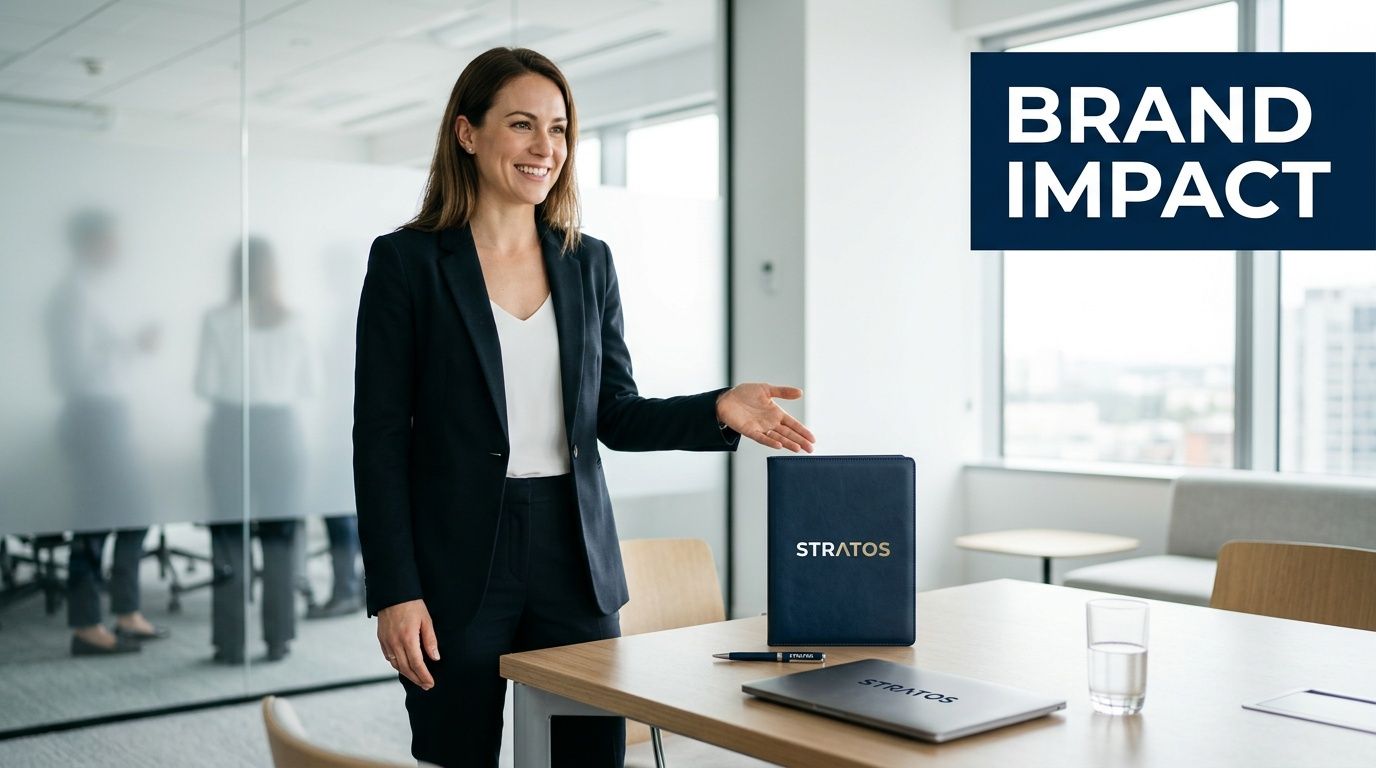
Utility creates better brand exposure
The strongest promotional products tend to be the ones people don't have to think about. They reach for them because they're practical. An A5 format is easy to carry, easy to store on a desk, and familiar across retail notebooks and office use.
That practicality matters in Australia because demand for stationery is broad and recurring across business, education, and administration. The ABS reports 9,712 schools across Australia in 2021 and around 4.0 million students in the education system, which helps explain why branded cover products remain relevant for student packs, staff kits, and events across major sectors, as noted in this education and stationery market reference.
If you're comparing branded stationery formats, it also helps to review broader expert padfolio advice so you can decide whether you need a simple cover, a full organiser, or something in between.
What it signals about your business
A well-specified cover sends a quiet message. It says your brand pays attention to details, values usefulness, and understands what people commonly carry into meetings. That's a stronger signal than a high-volume giveaway with no real role after the event.
Practical rule: If the item supports someone's workday, it has a better chance of staying visible.
There's also a perception benefit. A notebook by itself can feel temporary. A cover feels more deliberate. It frames the notebook as something worth keeping and replacing over time, which gives your logo more repeat exposure without needing to be loud.
For teams exploring broader branded stationery and office-use items, it helps to look at the full range of promotional product options before locking in one format.
Mastering A5 Notepad Cover Sizes and Specifications
“A5” sounds straightforward until the first sample arrives and the notebook doesn't sit properly inside it. That's one of the most common buying mistakes. The paper size is standard. The finished notebook often isn't.
For the Australian market, the core starting point is clear. An A5 cover should be engineered to the ISO 216 A5 size of 148 × 210 mm, and a useful explanation of that standard appears in this A5 notebook sizing guide. The catch is that A5 is a paper size, not a binding standard.
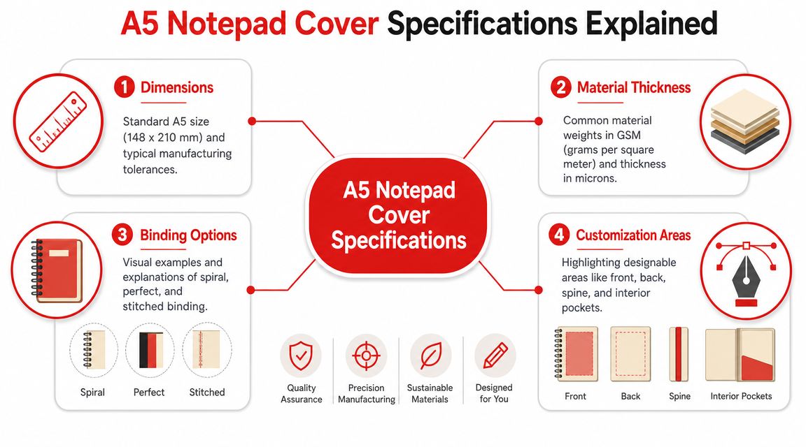
Size is only the first checkpoint
A flat A5 sheet tells you the page dimensions. It doesn't tell you the thickness of the insert, the bulk of a spiral, the stiffness of a hardback, or how a pen loop will press against the edge. That's why good covers allow for tolerance.
Tolerance is the small amount of extra room that prevents corner abrasion, page curl, over-tight closures, and awkward bulging at the spine. Too tight and the product looks wrong from day one. Too loose and it feels sloppy.
A practical spec discussion should cover:
- Internal fit: enough room for the actual insert, not just the raw paper size
- Spine behaviour: whether the cover needs to flex around stitched, glued, or spiral formats
- Closure pressure: how elastic straps or wraps behave once a pen is added
- Edge protection: whether the notebook corners stay protected during daily use
Binding type changes everything
A stitched notebook and a spiral pad may both be called A5. They don't behave the same inside a cover.
A stitched or glued insert usually suits a cleaner folio style. It sits flatter, carries less bulk at the edge, and often gives the neatest branded presentation for meetings or gifting. Spiral-bound pads need more forgiveness. The coil adds width and stiffness, and that affects how the front panel closes and how the spine sits when opened repeatedly.
A cover that “fits A5” can still fail in real use if the binding wasn't part of the brief.
Here's the simplest way to avoid that mistake:
- Choose the exact notebook first. Don't approve the cover as a stand-alone item if the insert is still undecided.
- Measure the actual product. Include width, height, thickness, and any protruding spiral or tab.
- Check loaded use. Add the pen, any internal cards, and the closure before judging fit.
- Review corner clearance. Tight corners are usually the first visible sign of a bad spec.
What a buyer should ask for
If you want fewer surprises, ask your supplier direct questions instead of relying on a generic “fits A5” label.
- Ask for internal dimensions, not just external ones
- Confirm which binding styles the cover was designed to accept
- Request advice on tolerance if you plan to source inserts separately
- Check whether pen loops or card slots reduce available notebook space
That extra discipline saves time later. It also stops a common procurement problem where the decorated cover looks excellent in a mock-up but becomes frustrating once staff or event guests start using it.
Selecting the Right Material for Durability and Impact
Material is where the a5 notepad cover starts to feel like your brand instead of a generic office accessory. Buyers often focus on unit cost first, but users respond to touch, finish, weight, and how the cover ages in real use.
The right material depends less on trend and more on context. A boardroom gift wants one outcome. A university handout wants another. A conference item that needs to travel in bulk has a different job again.
What repeated use actually demands
Durable covers are built for opening cycles, handling, and accessory stress. Features such as elastic closures, pen loops, and internal card slots improve utility, but they also create pressure points. Product specs from retailers serving this category show those features are common, and they make stitch quality, hinge reinforcement, and material thickness more important if you want a reusable shell instead of something that fatigues early, as reflected in this notebook cover construction reference.
That's why material choice should never be separated from construction. A premium surface on a weak hinge is still a weak product.
Matching material to brand position
Some materials say “executive”. Others say “practical”. Others say “considered and sustainable”. None of those is automatically correct. The fit depends on your audience.
What works and what doesn't
What works is alignment. If your audience values polish and longevity, a cover should feel substantial enough to justify that expectation. If your campaign is sustainability-led, the material story has to hold up under scrutiny, not just look eco-themed at first glance.
What doesn't work is choosing a material by photo alone. Texture, flexibility, and edge finish matter more in the hand than they do on a screen. The same applies to weight. Some buyers love the authority of a heavier cover. Others find it impractical for event bags or daily commuting.
A few grounded rules help:
- For client gifting: favour materials that age well and support subtle branding
- For staff kits: prioritise consistency, easy refill use, and reliable closures
- For large event distribution: keep shipping practicality and storage in mind
- For schools or programs: choose finishes that tolerate frequent handling without looking tired too quickly
The best cover isn't the fanciest one. It's the one your audience keeps using without friction.
If a sample feels stiff, check whether that stiffness will soften or whether it will fight the notebook every time it opens. If a material feels soft and flexible, check whether the corners and accessory points are reinforced enough for daily wear. Those are the trade-offs that separate a cover that lasts from one that only photographs well.
Your Guide to High-Impact Branding Techniques
Once the material is settled, branding becomes the make-or-break detail. The same logo can look restrained, sharp, or completely misplaced depending on the finish you choose.
Many first-time buyers often overcomplicate things. They try to put too much artwork on too small a product, or they choose a decoration method that fights the material instead of working with it.
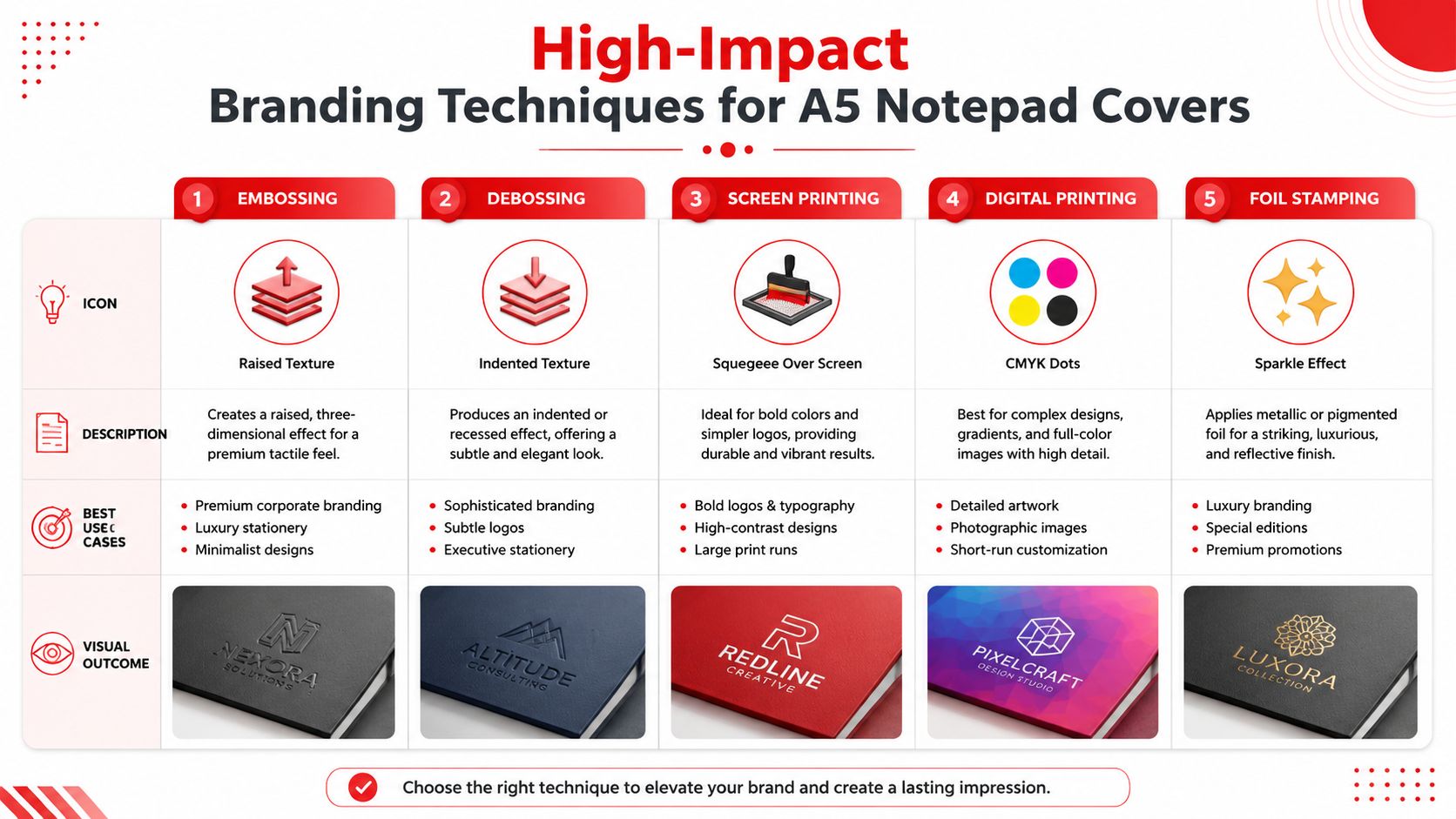
How each finish behaves
Embossing raises the logo above the surface. It gives the cover a tactile, premium feel and works best when the material has enough body to hold the detail cleanly.
Debossing presses the logo into the surface. It's subtler than print and often suits professional brands that want presence without shouting. On leather-look materials, it's one of the most reliable ways to achieve a refined result.
Foil stamping adds a metallic or pigmented layer. It creates more contrast and can look excellent on dark covers, but it needs careful handling in the artwork phase because fine detail doesn't always reproduce well.
Screen printing is useful when the mark needs to be bold and clear. It suits simpler logos and stronger colour contrast, especially on smoother synthetic materials.
Digital printing is the answer when your artwork includes gradients, illustrations, or a more colourful campaign look. If your brand system has multiple visual modes, it helps to review how different identities behave in print and product applications. A useful starting point is this guide to choose your website's graphic style, because it sharpens the conversation around whether your branding should feel minimal, corporate, editorial, or energetic.
Matching the method to the material
Not every branding technique suits every substrate. A soft, natural material may reward debossing but lose the crispness needed for a busy printed mark. A smooth PU cover often takes print cleanly, while textured recycled material may look better with a simpler, more tactile finish.
A quick decision framework:
- Choose debossing when you want understated credibility
- Use embossing if the cover material is premium and the logo shape is simple
- Select foil for VIP gifting or when contrast matters
- Use screen print for direct visibility and straightforward logo shapes
- Pick digital print for campaign artwork with colour complexity
Placement matters as much as method
The front cover is the obvious branding zone, but it isn't always the smartest one. Sometimes a smaller lower-corner logo looks more confident than a large centred mark. Interior pockets, back covers, and belly-band packaging can carry supporting graphics without overloading the main product.
That's why artwork review matters. Good suppliers will talk through finish, scale, and line weight before production. If you're comparing methods or preparing files, these custom printing options give a useful overview of how decoration choices translate across merchandise categories.
A5 covers usually look stronger when the branding is edited down, not built up.
A full-colour front panel can work for a campaign giveaway. A debossed mark can work better for a client gift. Neither is universally right. The strongest result is the one that matches the material, the audience, and the way the cover will be used.
Navigating the Ordering Process Like a Pro
The ordering stage is where good intentions either turn into a smooth rollout or get lost in avoidable revisions. By this point, most problems aren't creative problems. They're decision-order problems.
A buyer chooses a material before the notebook insert is finalised. Artwork is approved before decoration limits are checked. Delivery dates are discussed before sample approval is built into the timeline. That's how simple projects become stressful ones.
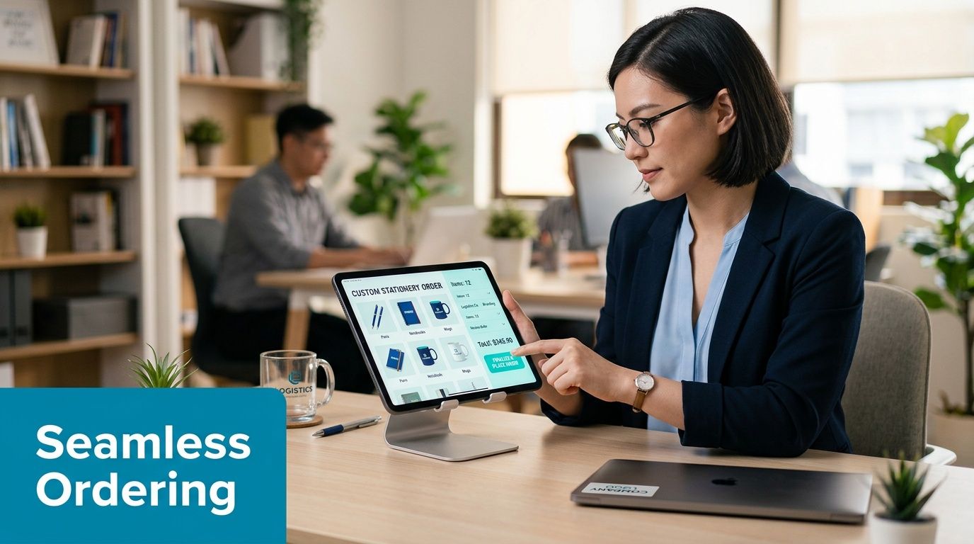
Think in one chain, not separate tasks
Material choice affects branding options. Branding affects proofing. Proofing affects production timing. Production timing affects how safely you can hit an event or onboarding date.
That means the job should be managed as one connected chain:
- Lock the intended use A conference giveaway, staff welcome pack, and executive gift all deserve different specs.
- Confirm the notebook and cover format This avoids late changes that force a redesign or a different closure.
- Approve artwork against the actual finish A logo that works in digital print may need simplification for debossing.
- Build in proofing time Digital mock-ups are useful. Physical samples are better when material, colour, or fit is critical.
A conference giveaway, staff welcome pack, and executive gift all deserve different specs.
This avoids late changes that force a redesign or a different closure.
A logo that works in digital print may need simplification for debossing.
Digital mock-ups are useful. Physical samples are better when material, colour, or fit is critical.
Samples prevent expensive assumptions
A mock-up tells you layout. A sample tells you reality. It reveals whether the material feels right, whether the hinge opens cleanly, whether the notebook sits properly, and whether the logo treatment feels balanced.
That's especially important when the order has internal stakeholders. Marketing might care about appearance. Procurement may care about consistency. HR may care about onboarding presentation. Operations may care about delivery windows.
For teams preparing files and reducing approval friction, these artwork submission tips for beginners are useful because they address many of the errors that slow down branded product jobs.
Compliance matters for Australian buyers
If your organisation is buying for government, education, or a large enterprise environment, sustainability language has to be handled carefully. The ACCC has warned against vague environmental claims, so buyers should ask for evidence behind recycled content or responsibly sourced materials, including origin details where relevant, as outlined in this recycled material compliance reference.
That check shouldn't happen at the end. It belongs near the start of procurement, especially if your internal policies require supplier evidence before approval.
A practical list to request includes:
- Material claim support: recycled content or sourcing documentation where applicable
- Origin clarity: whether the item is made locally or imported
- Decoration compatibility: whether the branding method supports the sustainability position
- Supplier paperwork: the documents your finance or procurement team needs before production
If your organisation uses formal purchasing workflows, this plain-English guide to PO numbers by Monopack ltd can help newer team members understand how purchase-order references fit into approvals and delivery tracking.
Procurement runs better when the product brief, artwork brief, and paperwork brief are all aligned before production starts.
One practical note from day-to-day project handling. Buyers who make decisions in the right order usually protect both timeline and budget. Buyers who treat fit, artwork, and compliance as late-stage checks usually end up paying in revisions, rush pressure, or compromise.
Creative Packaging and Distribution for Maximum ROI
A cover on its own can work. A cover delivered with intent works better. Distribution is where the product stops being merchandise and starts becoming part of an experience.
A new employee receives a welcome box on their first day. Inside is the branded A5 cover, a quality pen, and a short note from their manager. The item now has context. It isn't just stationery. It's part of how the organisation introduces itself.
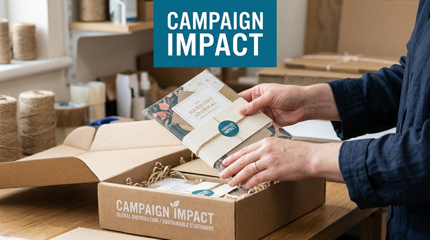
Three rollout ideas that lift perceived value
At a trade show, a plain stack of covers can look transactional. Add a simple belly band, insert a branded pad, and pair it with one of your promotional pens, and the product feels complete. It's easier for staff to distribute and easier for recipients to understand immediately.
For a client gift, presentation should be quieter. Tissue wrap, a slim card, and a refined logo treatment can do more than oversized packaging. The goal is to make the cover feel chosen, not bundled.
For internal programs, consistency matters most. If every branch, office, or intake group receives the same well-packed kit, the product helps reinforce brand standards as well as visual identity.
Distribution should follow the use case
Different audiences need different handover methods:
- Onboarding kits: deliver fully assembled so the employee can use it on day one
- Conference packs: keep packaging compact so staff can hand it out quickly
- VIP gifting: add a personal note or meeting-specific insert
- Education or community programs: prioritise durable packing that handles volume cleanly
The packaging should never compete with the cover. It should make the cover easier to receive, carry, and keep.
The simplest ROI improvement is often this. Don't hand over a branded cover as an isolated object. Hand it over as a ready-to-use tool.
Your Final Checklist for a Perfect Order
A strong order usually comes down to a handful of clear decisions made early and checked once more before approval. That discipline matters because Australia has a broad business base buying practical branded stationery. The ABS reports 2.6 million actively trading businesses in Australia, which is one reason low-cost, high-utility items such as branded stationery continue to suit offices, events, and client meetings, as noted in this Australian business market reference.
Before you sign off, check these points:
- Notebook fit is confirmed: the cover matches the exact insert, not just a generic A5 label
- Binding has been accounted for: spiral, stitched, refillable, and hardback formats behave differently
- Material matches the audience: premium, professional, or eco-conscious should be a deliberate choice
- Branding method suits the substrate: your logo should work with the finish, not fight it
- Artwork files are production-ready: correct formats, clean linework, and approved placement
- Compliance questions are resolved: especially if sustainability claims or procurement standards apply
- Delivery timing includes proofing: don't back-calculate from the event date alone
- Packaging supports the rollout: ready for onboarding, gifting, or event distribution
If you're ready to turn the brief into an actual product order, this promotional product ordering page is a practical next step.
A good a5 notepad cover order doesn't happen because the product is simple. It happens because the buyer treats it like a small brand project and gets the details right.
If you'd like help shaping your first A5 notepad cover brief, Simply Merchandise can assist with the practical decisions that matter most, including fit, branding method, artwork preparation, and rollout planning for events, onboarding, or client gifting.

