



You've shortlisted a few fonts. One looks elegant on your laptop. Another feels bold and modern. A third has just enough personality to stand out. Then the test arrives. Your logo goes on a pen, a cap, a polo shirt, a mug, a tote bag, and a lanyard. Suddenly the font that looked refined on screen turns into a blur, a tangle, or a stitched blob.
That's the moment most businesses realise the best font for logo design isn't just the prettiest typeface in a brand presentation. It's the one that keeps working when production gets involved.
In merchandise, fonts don't live in ideal conditions. They're embroidered into textured fabric, engraved into metal, printed on curved drink bottles, and reduced to tiny widths on pens and badges. A font has to survive all of that without losing its voice. If it can't, the brand pays for it in rework, weak visibility, and products that look cheaper than they should.
A lot of logo advice still focuses on websites, apps, and clean mockups. That's useful, but it misses the practical side of branding that matters when your logo has to travel. If you're building a serious brand system, the thinking behind high performance brand development is worth understanding because strong identity work always has to hold up in the world, not just in presentation slides. The same applies when planning promotional products that people will wear, carry, and keep.
Your Logo Font Is More Than Just a Pretty Face
A logo font often gets judged too early. People pick it while looking at a clean white artboard, full size, perfectly lit, with no production constraints. That's how expensive mistakes begin.
The font that wins in practice is usually the one that behaves like a workhorse. It stays readable when it's stitched on a chest, printed small on a pen barrel, or engraved onto a key ring. It doesn't need ideal conditions to look good. It performs under pressure.
A good logo font doesn't ask the product to adapt to it. It adapts to the product.
That's why some of the most visually striking fonts fail once they leave the screen. Fine strokes disappear. Tight counters clog. Decorative terminals lose definition. Script joins that look beautiful in a brand deck become messy on textured materials.
Screen beauty versus physical reality
When a business asks for the best font for logo use, the question isn't “Which font is most stylish?” It's “Which font will still look like us everywhere we use it?”
That's a different decision.
A logo on merchandise has to do several jobs at once:
- Stay legible at small sizes on products like pens, badges, and USB drives.
- Hold shape on textured surfaces such as caps, polos, beanies, and tote bags.
- Translate across branding methods including embroidery, screen printing, laser engraving, and debossing.
- Keep brand personality intact so the logo still feels premium, friendly, serious, playful, or technical.
The font has to earn its place
A decorative font can still work. A serif can still work. Even a script can work in the right setting. But none of them gets a free pass. The font has to earn its place by proving it can survive production, distance, and scale.
That's where smart logo selection becomes less about taste and more about judgement.
The Four Pillars of a Timeless Logo Font
A timeless logo font does four things well. Miss one, and the identity becomes harder to use, harder to reproduce, or harder to trust.
Think of these as the filters every font should pass before it becomes part of your brand.
Legibility
If people can't read the name quickly, the logo is already underperforming.
Legibility matters most when your logo appears at small sizes or on imperfect surfaces. That's why fonts with clear shapes, open counters, and steady stroke widths usually outperform more stylised options. This becomes even more important once the mark is stitched or printed on fabric. If you're not familiar with how thread changes letterforms, it helps to understand the practical constraints of embroidery branding.
A legible font doesn't need to be plain. It needs to be clear.
Personality
A logo font also has to sound like your brand without saying a word.
A law firm, school, tech startup, not-for-profit, and hospitality venue shouldn't all use the same typographic voice. Serif fonts often feel established and formal. Sans-serifs can feel modern, direct, and efficient. Script fonts can feel personal or premium. Display fonts can feel bold, playful, or niche.
The mistake isn't choosing a font with character. The mistake is choosing one whose character fights the brand.
Practical rule: If the font has more personality than the business itself, it will dominate the identity instead of supporting it.
Scalability
A logo font has to perform at opposite extremes. It needs to look controlled on a website header and stay recognisable when reduced for product decoration. It should also hold together when enlarged on signage or event walls.
Fonts that rely on fine detail, dramatic contrast, or fragile spacing often fail this test. Their elegance comes from conditions that don't exist in day-to-day branding.
Versatility
The best font for logo use isn't trapped in one mood or medium. It should work on a polished annual report, a conference lanyard, a staff uniform, and a welcome pack.
That usually means asking a few harder questions before approval:
- Can it work in one colour? Many merchandise applications don't allow complex colour effects.
- Can it sit beside an icon? Some fonts become awkward when combined with graphic marks.
- Can it support a wider brand system? Your logo font should pair cleanly with secondary fonts for packaging, web, and print.
A quick filter before you commit
Use this shortlist test before you move forward:
- Shrink it hard. If it fails on a small mockup, it won't improve in production.
- Remove the colour. A font that needs colour to feel interesting is a risk.
- Place it on fabric and metal mockups. These reveal weakness quickly.
- Read it from a distance. If the shape collapses, so does recall.
Timeless fonts aren't timeless because they're safe. They're timeless because they keep working.
Choosing Fonts for Real-World Merchandise
Merchandise exposes every weakness in a logo font. What feels balanced in a digital proof can break down once thread, ink, pressure, heat, or engraving enters the process.
That's why production teams care less about trendiness and more about the anatomy of the letters. Stroke contrast, x-height, spacing, counters, joins, and terminal shapes all affect how well a logo survives on physical products.
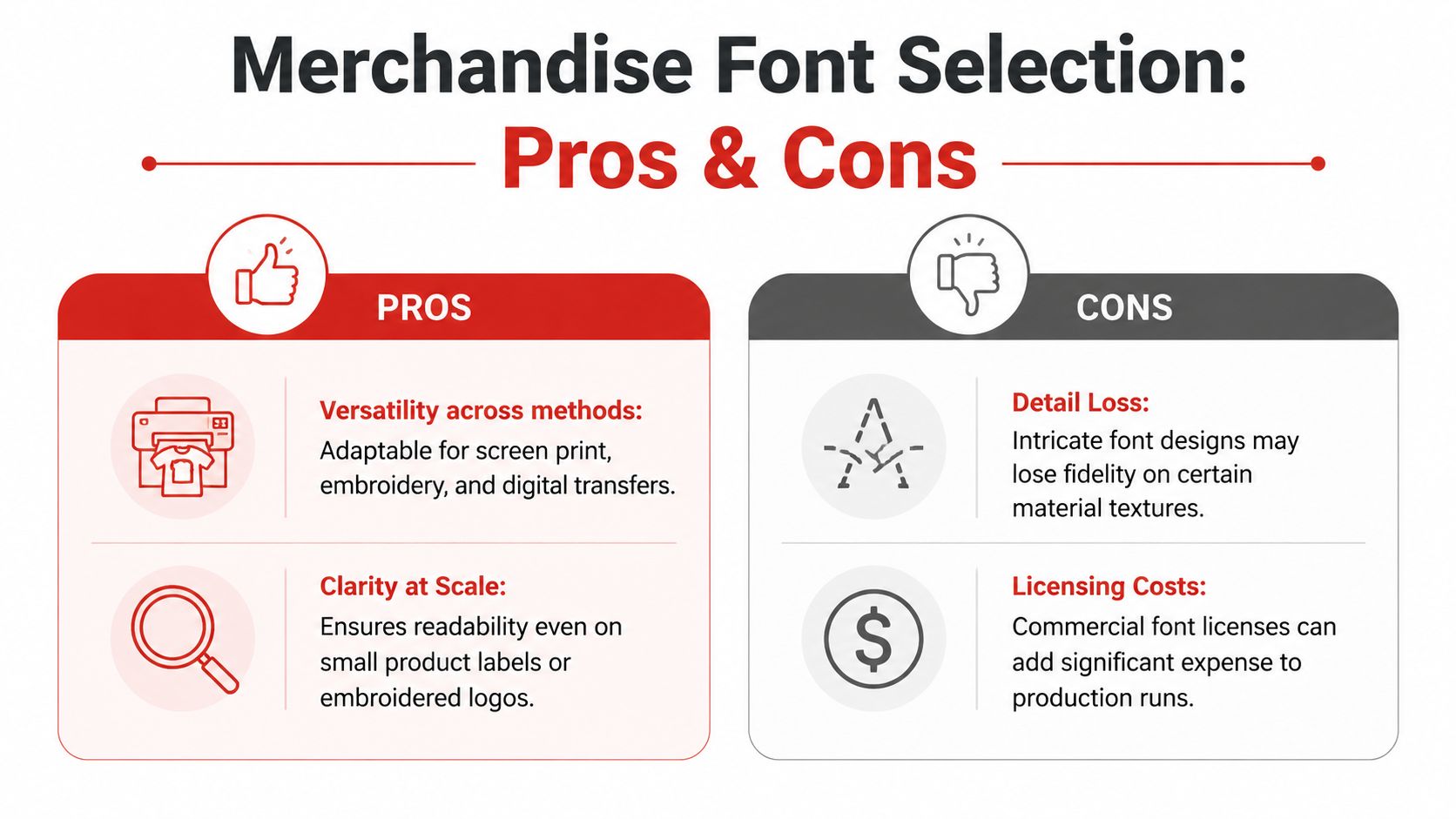
What works better on fabric and small items
For Australian merchandise use, low-contrast geometric sans-serifs tend to hold up well because they keep their form across different branding methods. One useful benchmark is Instrument Sans, which was noted for uniform stroke widths and high x-height ratios that support 98% character recognition at 12pt sizes in screen printing and embroidery, according to Figma's summary of the AGDA-backed findings. The same source notes that a 2023 AGDA study found these fonts retained 25% higher readability on fabric substrates such as lanyards and beanies under varied lighting than higher-contrast alternatives.
That result makes sense in production. Fabric isn't a clean vector environment. It introduces texture, movement, and edge softness. Fonts that are even, open, and sturdy usually cope better.
Where fonts fail by branding method
Different decoration methods punish different weaknesses.
Embroidery
Embroidery simplifies shapes. Thin strokes can vanish. Tight internal spaces can close up. Sharp joins may soften.
Fonts that usually struggle here include:
- Delicate scripts: connected forms become crowded
- High-contrast serifs: fine details don't hold
- Compressed display fonts: counters close too quickly
Safer choices are fonts with broader forms, cleaner spacing, and less contrast between thick and thin parts.
Screen printing
Screen printing can handle strong graphics well, but tiny details still cause trouble. If the font has fragile hairlines or unusual ornamentation, those details can print inconsistently on items like tote bags, tees, and notebooks.
A clean sans-serif often wins here because it preserves edge clarity and remains readable when reduced.
Laser engraving and debossing
These methods reveal spacing problems fast. Letters that sit too tightly can merge visually. Small counters fill in. Decorative edges become muddy.
The AGDA-backed findings cited above also warn that high-contrast alternatives can create fill-in artefacts in small-scale laser engraving on compact merchandise applications such as badges and tech accessories.
If your logo relies on thin elegance, laser engraving is often where that elegance disappears first.
Match the font to the product, not just the brand deck
The smartest font decision often comes from looking at your product mix first.
A brand that mostly lives on uniforms needs a different font strategy from a brand that mostly appears on premium packaging.
The practical test most teams skip
Before approving a font, put it through real product mockups. Don't stop at a logo sheet. Place it on branded clothing, a bottle, a tote, and one small hard-good item. Use one-colour versions. Shrink the logo further than feels comfortable.
If it still looks confident, you're probably close. If it starts to fight the medium, the font isn't ready.
A Practical Guide to Font Categories and Pairings
Most businesses don't need more font options. They need better judgement about which category fits their brand and where that category will succeed on merchandise.
The easiest way to choose the best font for logo use is to stop asking which font is “best” in the abstract and start asking which category best suits your brand's personality, product mix, and production needs.
Sans-serif fonts
Sans-serifs are often the safest category for physical branding. They tend to reproduce cleanly, hold up at small sizes, and adapt well across digital and print uses.
For merchandise, they're usually the first place to look if your logo needs to appear on uniforms, drinkware, tech items, and event collateral. A well-built sans-serif can feel modern, efficient, premium, or approachable depending on its proportions and spacing.
One notable example is Neue Swift, which achieved 92% legibility in full-colour digital printing on eco-products and tote bags and reduced moiré patterns by 35% in high-resolution printing versus standard fonts, according to Vistaprint's summary of the 2025 AU Printing Industries benchmark. The same source notes that high-flow typefaces showed 22% lower reversion rates in client artwork revisions, largely because their spacing reduces kerning issues at small sizes.
That matters more than many teams expect. Fewer artwork revisions usually mean fewer production delays and fewer surprises once goods arrive.
Serif fonts
Serifs can project trust, heritage, and authority. They often suit legal, financial, educational, and premium service brands.
But serifs need discipline. Moderate serif structures can work well on larger printed applications and premium gifts. Fine or high-contrast serifs can become fragile on embroidered items or small engravings. If your core product mix includes caps, polos, or compact accessories, a serif logo needs extra scrutiny.
Script fonts
Script fonts create warmth, elegance, and personality. They can be effective for beauty, boutique retail, hospitality, and artisan brands.
They're also the easiest category to misuse.
Scripts struggle when reduced, stitched, or engraved. Connected strokes can tangle. Fine entry and exit points weaken. A script logo may still work if it's custom-drawn, simplified, and used mainly on larger print surfaces, but it rarely offers the flexibility most growing brands need.
Display fonts
Display fonts are built to stand out. They suit campaigns, sub-brands, seasonal marks, and event-led identities more than long-term workhorse logos.
They can be brilliant in the right context. They can also age quickly and reproduce poorly if their distinctiveness depends on intricate features.
For brands ordering high-volume merchandise, display fonts usually work better as supporting graphics than as the main logo font.
Font category suitability for promotional merchandise
| Font Category | Best For (Personality) | Ideal Merchandise | Use With Caution On | |---|---|---| | Sans-serif | Modern, clear, adaptable | Uniforms, pens, mugs, bottles, tote bags | Very small engraving if spacing is too tight | | Serif | Established, premium, trustworthy | Corporate gifts, printed folders, larger tote graphics | Embroidery, small accessories, compact debossing | | Script | Elegant, personal, boutique | Larger packaging, select gift items, beauty applications | Caps, polos, pens, badges, laser engraving | | Display | Bold, niche, expressive | Campaign items, event signage, limited-run merch | Everyday brand assets, small-format decoration |
Pairings that keep the brand usable
Your logo font doesn't have to do every job alone. In fact, it shouldn't.
A strong pairing system often looks like this:
- Logo font with personality: used in the primary mark
- Secondary sans-serif: used on websites, packaging, brochures, and merchandise copy
- Optional campaign font: used sparingly for promotions or event graphics
If you're also designing posters, event boards, or show signage, it helps to study how printers think about choosing powerful poster fonts, because the same decisions around distance, clarity, and impact apply to branded merchandise.
The best pairing is the one that keeps the logo distinctive without making the rest of the brand harder to produce.
Navigating Font Licensing and File Formats

A logo font can look perfect and still create problems if you don't own the right to use it properly. This catches businesses more often than it should.
Designers sometimes build a logo with a trial font, a personal-use download, or a licence that covers only one type of use. That may not show up immediately, but it becomes risky once the logo moves onto merchandise, packaging, websites, signage, and internal documents.
What to confirm before approval
Ask for the exact font name and the exact licence type. “Free” doesn't always mean free for commercial branding.
Check whether your use needs:
- Desktop rights for design and artwork creation
- Web rights if the typeface appears on your website
- App or digital product rights if relevant to your business
- Commercial logo use permission if the font maker treats branding as a separate use case
If the font is heavily modified, ask whether the final logo has been converted to outlines. That helps avoid font dependency in production files.
Key check: If no one on your team can answer where the font came from and what rights were purchased, the logo isn't fully approved.
Why vector files matter so much
A PNG is useful for quick sharing. It is not enough for production.
For merchandise, your logo should be supplied in vector formats such as AI, EPS, or SVG. A simple way to think about it is this. A raster file is a picture of the logo. A vector file is the construction of the logo. That's why vectors can scale cleanly and remain editable for different branding methods.
You'll usually need vector artwork for many custom printing options, especially when the same logo must move across screen printing, engraving, embroidery setup, and full-colour applications.
The minimum handover file set
Ask your designer for:
- Vector master files in AI, EPS, or SVG
- High-resolution PNGs with transparent background
- One-colour and reversed versions
- Outlined versions so the logo no longer depends on the font file
- A basic usage guide covering spacing, colour, and minimum size
That handover prevents a lot of future friction. It also makes production faster when different suppliers need consistent artwork.
The Future of Logo Fonts and Sustainable Branding
Font choice is starting to do more than shape aesthetics. It's becoming part of how brands think about efficiency, sustainability, and long-term production.
One important projection for 2026 is the rise of eco-friendly fonts in Australian branding. According to Studio 2am's summary of the relevant data, variable fonts can offer 20-30% ink savings in digital printing, while heavy geometric fonts can increase sublimation energy use by 18%. The same source notes that using eco-fonts for logos has been shown to boost perceived sustainability by 35% in Australian consumer surveys.
That's not just a design trend. It changes how a logo performs at scale.
Lighter thinking, stronger systems
When businesses print across tote bags, drink bottles, event packs, and collateral, the structure of a typeface affects material and print behaviour. Lighter, more efficient forms can support sustainability goals without making the brand look weak.
Variable fonts add another layer of flexibility. They allow a brand to fine-tune weight and width more precisely, which can help maintain consistency across digital and physical applications while reducing excess ink in some print workflows.
For teams ordering eco products, that's a useful shift. The logo itself can support the sustainability message rather than just sitting beside it.
Sustainability still needs production discipline
Eco-aware font choice only works if the artwork is technically sound. If the logo is supplied in poor file formats, or if the artwork isn't adaptable, any sustainability gain gets undermined by rework and print waste. That's why a clear grounding in understanding raster and vector artwork matters when a brand starts thinking more seriously about efficient production.
Sustainable branding isn't only about recycled materials. It's also about making design choices that reproduce cleanly and waste less.
The future of the best font for logo selection is less about novelty and more about intelligent restraint. Brands that choose fonts with both production efficiency and brand clarity in mind will have an advantage.
Your Final Logo Font Approval Checklist
A final font decision should feel calm, not rushed. If the logo still raises doubts, stop and test it again before approving stock, signage, uniforms, or campaign assets.
The strongest approvals usually come from a simple checklist, not from opinion alone.
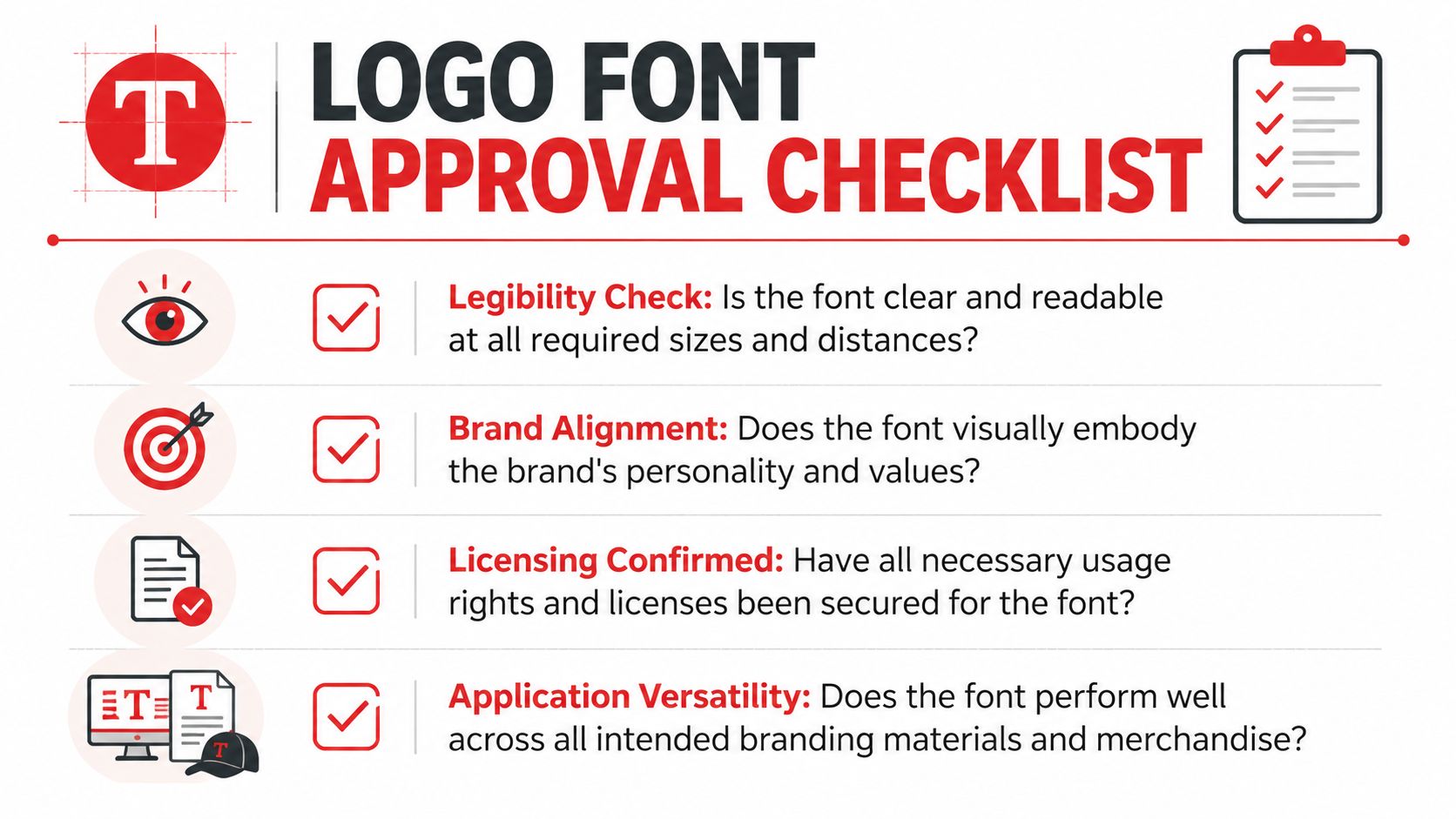
Ask these questions before sign-off
- Legibility first: Can you still read it clearly on a pen, badge, or chest embroidery?
- Brand fit: Does the font reflect the business accurately, or is it trying too hard to be stylish?
- Merchandise readiness: Have you seen it mocked up on the actual products you're most likely to order?
- One-colour performance: Does it still work in black, white, or a single spot colour?
- Spacing check: Do any letters collide, blur, or create awkward gaps at smaller sizes?
- Licensing confirmed: Has someone verified the commercial rights?
- Vector files secured: Do you have AI, EPS, or SVG versions, plus outlined artwork?
- Long-term flexibility: Will this font still feel right on next year's uniform order, expo stand, and onboarding kit?
The approval standard that saves money
If a font only looks good in one context, it isn't ready. If it needs ideal conditions, it isn't ready. If no one has tested it on real merchandise, it definitely isn't ready.
The best font for logo use is the one that stays clear, recognisable, and on-brand wherever your business appears. That includes the smallest, toughest, most physical brand moments. Often, those are the moments customers remember most.
If you're ready to turn a logo into merchandise that looks sharp in production, Simply Merchandise can help you choose the right products, branding method, and artwork setup for everything from pens and mugs to uniforms, totes, and eco ranges. Their team works with Australian businesses nationwide to make sure your brand doesn't just look good on screen. It performs where people see it, use it, and keep it.

